The Ultimate Branding Checklist
Your go-to-branding guide is just a click away!


Kerning, Tracking & Leading: Introduction to Typography #4

Good or bad spacing can make or break a piece of typography. Paying attention to the spacing between letters, words and sentences can be the difference between the ability to accurately and efficiently read your text or not, so it’s important to get it right.
There are three main spacing issues to consider when it comes to typography: kerning, tracking and leading. Mastering these three things will provide you with the main tools in your typography toolkit for manipulating text.
“Spacing is the big enchilada” — James T Edmonson
KERNING
Kern (verb.) adjust the spacing between (characters) in a piece of text to be printed.
Kerning means adjusting the space between individual characters within a word. This is mostly used for singular words in a logo or heading that is going to be used at a large scale.
There’s no need to adjust the kerning in body copy as that would take hours and hours and hours and the spaces are too minor to be noticed, but anything that will be viewed at a large scale will need to be kerned.
The majority of typefaces, especially if they’re not great, will need some kerning adjustment. The spacing between letters should always read quite evenly — it shouldn’t jump out at you that letters are touching or they’re too close together or too far apart. Everything should be consistent and not distract you from the word itself.


There are a lot of examples of kerning gone wrong. This can cause major legibility issues and even transform words into new, sometimes embarrasing, words. For example, if you put a c and an l too close together, they can look like a d which could easily make click look like d*ck, and so on. So you want to be super careful with your kerning, especially in things like logos, signage, billboards and large posters in order to avoid making these awkward mistakes.
If you get the kerning right, it will make the word feel really natural to read and not distract from the word itself. You don’t want a big glaring gap that will attract the attention from what the word is or what your brand is.
“God is in the kerning” — Matteo Bologna
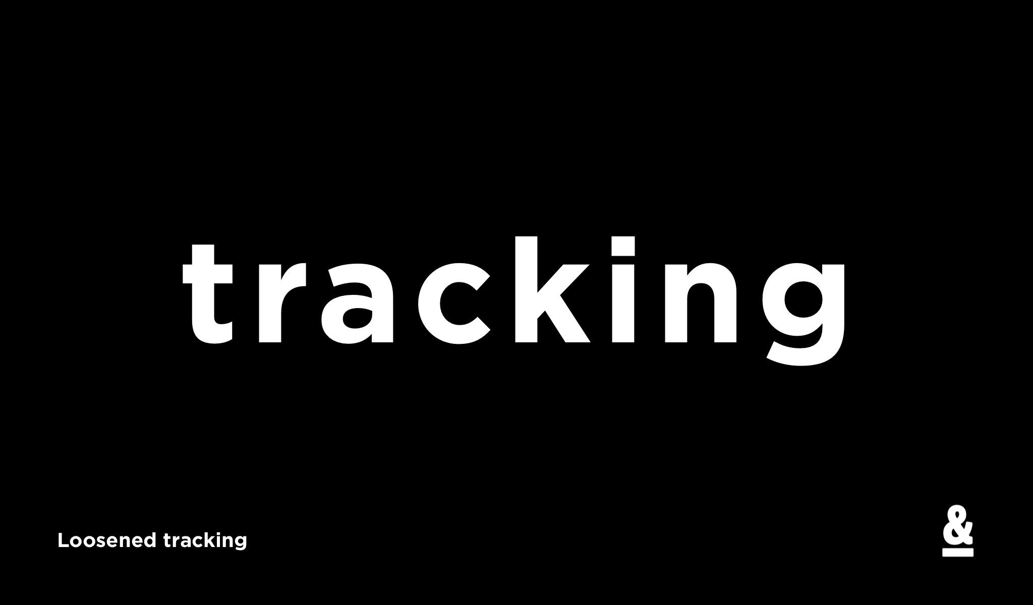
TRACKING
Tracking adjusts the spacing between letters evenly across the whole word.
This is particularly helpful when working with type that is set in all-caps. All-caps often looks better with more space, especially if you are using a heavier weight of font that requires more average spacing across the whole word. Tracking allows you to do this.
Some fonts will as a default seem like everything is too cramped together, so increasing the tracking can make it seem more comfortable and easier to read.
LEADING
Leading is the space between lines in a body of text. If you have any type of paragraph or anything with multiple lines of text, you have to really pay attention to the leading.
Too tight and your text will appear cramped and require the reader to squint in order to read it. Too loose and it gets hard to read as the reader gets lost due to the large gaps in between where it’s too spread out to keep track as you read along.


You want to create leading that is comfortable but not too spread out because you don’t want to lose people as they’re reading.
A general rule of thumb with kerning, tracking and leading, is to never accept what the computer provides you. The programme will suggest the default which is generally incorrect. Pay attention to all three of these methods of spacing in order to create the perfect typographic layout.
To learn more about typography, read the first three articles in this series here, and follow me to stay tuned for #5!
Pin one of these graphics to save this post for later

August 29, 2017
Typography


more from


The undiscovered to unforgettable challenge

Your 60+ free content ideas for artists are just a click away!

.svg)


Checking out the bottom of the page? You must be looking for something good. Maker & Moxie® is here for creatives - we want to help you reach more people, feel confident sharing your work, and empower you to keep creating, making, and inspiring the world.